more for "Prøts"
For Prots, a duo of two open-hearted men who guide individuals and groups through conversation and connection, I created a playful and distinctive logo that perfectly reflects what they’re about even if that’s still a little vague. Prots is about “protsen” and “verprotsen”sharing, listening, expressing, and opening up through honest communication. It’s soft, accessible, and doesn’t need to be clearly defined.
They weren’t exactly sure what they were yet and that’s part of the beauty. I leaned into that vagueness and translated it into a logo that’s intentionally imperfect, quirky, and full of warmth. No straight lines, no cold minimalism. Instead: wobbly shapes, hand-drawn elements, and a sense of movement that invites openness and play. Because for them, playfulness is essential you must always keep playing.
The result is a visual identity they were truly happy with one that feels like them, looks like them, and sets the right tone: kind, inviting, and proudly “protserig”.


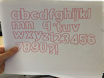
The typeface is handwritten because something too perfect or polished just didn’t feel right. This version has a more human, unfiltered energy to it. It brings the kind of honest character that you won’t find in a clean, standard font. It feels personal and that's what it needs.
I also experimented with 3D printing by creating keychains based on the design. It was something I’d been curious about for a while a fun way to try something new and get hands-on with the process. It gave me the chance to play, test, and learn by turning a digital idea into something physical
font